Description
Although hard to admit, but long gone are the days of word of mouth referrals for realtors. Today, many real estate companies have decided to use custom real estate signs to promote themselves. Which is why the only real question should be “How do I make my real estate sign standout?” cause in such a saturated market, having a sign that doesn’t fall victim to banner blindness can greatly affect the time required for selling a house. In fact, a well designed sign can quickly become your most powerful marketing tool by bringing in more phone calls, office visits and open house visits, thereby making the rest of your marketing and advertising a lot easier. So the help make your real estate sign the most powerful tool in your arsenal, we have compiled a few tips and tricks most realtors overlook when designing a sign.
Picking the best material
Regardless if you choose to use a pre-made sign or design your own, picking the right material can affect both the buyer’s perception of the property and the sign’s lifetime value. An important tip when browsing our range of materials is that all of our signs are built using quality materials, is it just that each material is better suited for a different situation.
 Coroplast
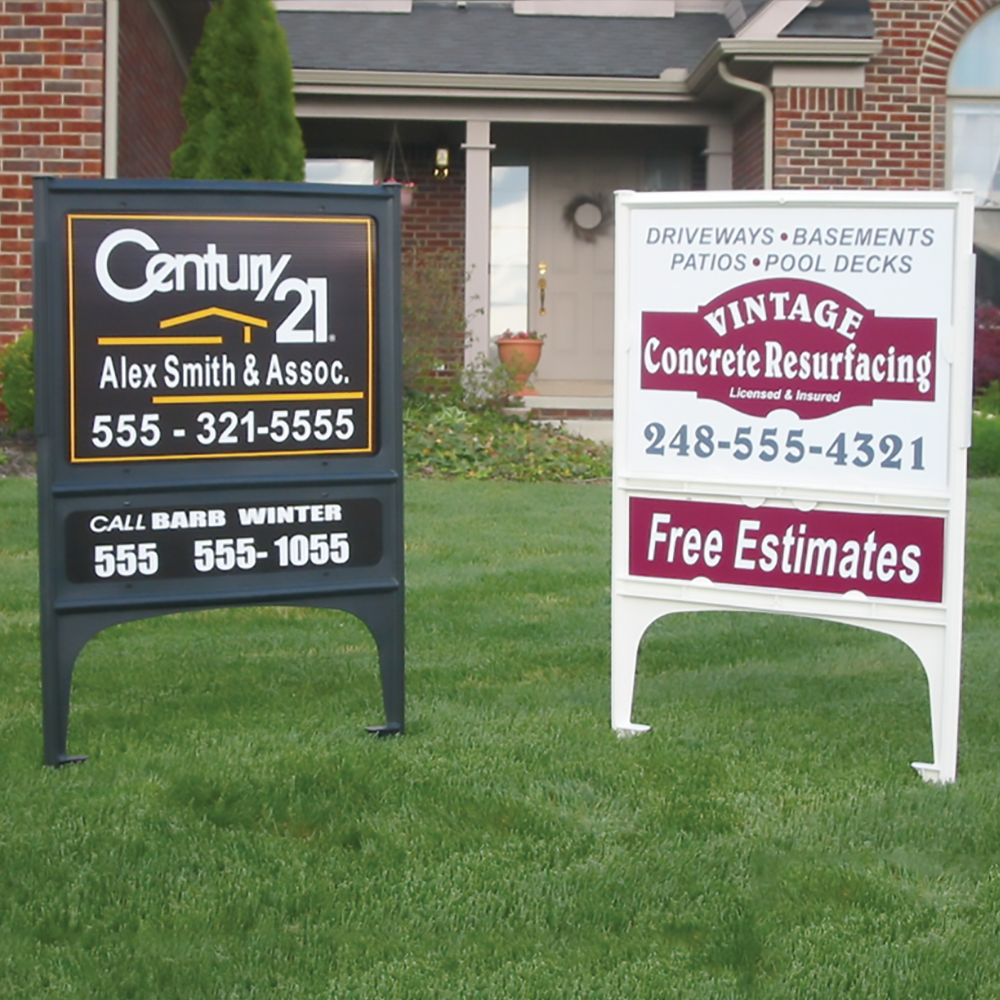
The perfect mix of price and durability, our extremeply lightweight coroplast signs are made with corrugated plastic and are great for homeowners wanting to sell their own house. These signs will outlast a storm but, may not provide the best value for realtors wanting to constantly reuse this sign for years to come.

White .040 Aluminum
This lightweight, yet strong material is the most popular and our go-to material for most signs. It’s duarability means you can reuse the sign over and over and you won’t have to worry about leaving it outside. If you are unsure about what to use and just want an affordable sign for constant use, this would be our top recommendation.

3mm Nudo Board
Our Nudo Board real estate signs have two aluminum panels with a solid plastic core. Great for someone who wants a premium look without needing a second person to help them lift it. These signs are great for extended outdoor use.
Make it easier for buyers to contact you
Another very important tip is to make it easy for potential buyers to contact you. Although this sounds simple, our years of experience has shown us that many people forget about these 6 things when making a sign.
- Use large text for your phone number. Everyone is able to infer that your house is for sale by the presence of a sign but, without a contact number, how are they going to get in touch with you?
- Include a QR code so people can quickly scan your sign and pull up more information. If you don’t know how to get a QR code just contact us.
- Include a rider with any unique selling points the property might have. Some examples may include a pool, 4 bed/3 bath etc.
- Attach a brochure box so people can look at other properties of yours if they decide this one isn’t for them.
- Use contrasting colors for any text. If you decide to be creative and make your background a bright color, don’t use a similar bright color for the text. It just guarantees a headache for anyone trying to read your sign.
- Make use of white space – the space between different images, pictures and text on your sign. If your sign has too much information on it then no one is going to see what you want and they’ll be more likely to ignore your sign altogether. Use a brochure box if you think you think your sign looks crowded with too much text.


 Coroplast